
Summary
Choosing a color scheme for your home can seem like a daunting task, but there are a few steps that you can take to ensure you get it just right. In this article, we’ll explore the factors that you’ll want to consider when choosing your color scheme, as well as where and when to use the most common color schemes: light, dark, bright, and muted.
Factors to Consider
When interior designers embark on a design project, selecting an appropriate color scheme is a crucial aspect of their creative process. The color scheme sets the tone, ambiance, and overall aesthetic of a space. To decide on a color scheme, interior designers typically consider several key factors:
Client Preferences
Designers begin by understanding their client’s taste, style, and any specific color preferences they may have. This initial discussion helps establish a foundation and ensures that the final color scheme aligns with the client’s vision for the space.
Purpose and Function of the Space
Each space has a purpose and function, such as a living room, bedroom, or office. The designer considers the activities that will take place in the room and the desired atmosphere. For example, a bedroom may require soothing colors to promote relaxation, while a vibrant color scheme could be suitable for an energetic office environment.
Lighting Conditions
Natural and artificial lighting play a significant role in how colors appear within a space. Designers evaluate the available light sources, the direction and intensity of light, and how they interact with different hues. They consider whether the room receives ample natural light or if it relies heavily on artificial lighting, as this can influence the choice of colors.
Spatial Considerations
The size and proportions of the room influence color choices. Darker colors tend to make a space feel smaller and more intimate, while lighter colors create an illusion of openness and spaciousness. Designers take into account the room’s dimensions, ceiling height, architectural features, and existing elements, such as flooring and furniture, to ensure the color scheme enhances the overall spatial experience.
Color Psychology and Mood
Colors evoke specific emotions and moods. Interior designers study color psychology to understand the psychological impact different hues can have on individuals. They consider whether they want to create a calming, stimulating, or balanced atmosphere within the space and select colors accordingly. For example, cool colors like blues and greens often promote tranquility, while warm colors like reds and yellows can create a sense of energy and passion.
Color Harmonies and Relationships
Designers also explore different color harmonies and relationships to create visually appealing schemes. They may use concepts such as complementary colors (opposites on the color wheel), analogous colors (adjacent on the color wheel), or monochromatic schemes (variations of a single color). These techniques help establish a cohesive and harmonious palette that balances contrasting or harmonizing colors effectively.
Trends and Styles
Designers stay informed about current trends, styles, and color forecasts. While they prioritize their clients’ preferences, they may also incorporate trendy colors or adapt popular color schemes to give a contemporary touch to the space. Trend research ensures that the design feels relevant and up-to-date.
After considering these factors, interior designers often create mood boards, sketches, or digital presentations that showcase the proposed color scheme along with materials, textures, and furniture selections. This helps clients visualize the intended aesthetic and ensures a shared understanding of the project’s direction. Having this knowledge of design principles is one of the many reasons interior designers can add value to your home renovation or new build project.
Common Color Schemes
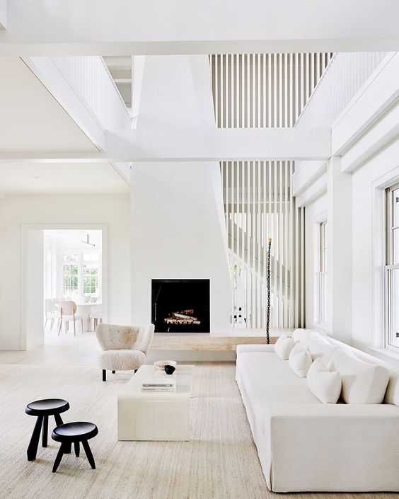
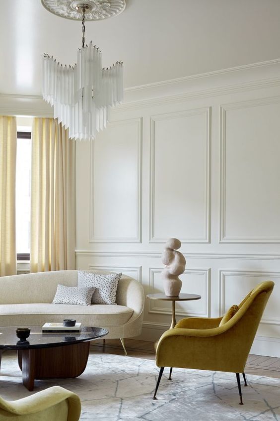
Light Color Schemes
Designers may choose a light color scheme in several situations, depending on the desired outcome and the specific characteristics of the space. Here are a few scenarios where a light color scheme could be appropriate:
1. SMALL OR CONFINED SPACES
Light colors, such as whites, pastels, or soft neutrals, can make a small or confined space feel more open and airy. Lighter hues reflect more light, creating an illusion of spaciousness and expanding the visual perception of the room. This approach is often employed in compact apartments, small bathrooms, or narrow hallways.
2. NATURAL LIGHT ENHANCEMENT
Rooms with ample natural light can benefit from a light color scheme to maximize the brightness and create a cheerful atmosphere. Lighter colors reflect and amplify natural light, making the space feel more vibrant and inviting. This is particularly advantageous in sunlit living rooms, sunrooms, or spaces with large windows.
3. MINIMALIST AND CONTEMPORARY AESTHETICS
Light color schemes are often associated with minimalist and contemporary design styles. The clean and crisp look of light hues, such as whites or light grays, can contribute to a sense of simplicity, elegance, and modernity. This style choice is popular in contemporary homes, Scandinavian-inspired interiors, or spaces that prioritize a sense of calm and serenity.
4. SERENE AND TRANQUIL ENVIRONMENTS
Light color schemes, especially those featuring cool tones like pale blues or soft greens, can create a serene and tranquil ambiance. These colors are often associated with relaxation, making them suitable for bedrooms, bathrooms, or spaces intended for rest and rejuvenation.
5. ACCENTUATING NATURAL TEXTURES AND MATERIALS
Light color palettes can enhance the beauty of natural textures and materials, such as wood, stone, or natural fibers. Lighter hues allow the inherent qualities and textures of these materials to take center stage, creating a harmonious and organic feel. This approach is common in rustic or coastal-inspired interiors.
6. GENDER-NEUTRAL OR VERSATILE SPACES
Light color schemes are often chosen for spaces that need to appeal to a wide range of tastes or accommodate various purposes. Neutral colors like whites, creams, or light grays can create a gender-neutral environment that is versatile and adaptable to different styles and design preferences. This is beneficial for shared living areas, multi-purpose rooms, or spaces that require flexibility.
It’s worth noting that while light color schemes can create a sense of openness and brightness, excessive use of light colors without appropriate contrast or accents may result in a space that feels too sterile or lacking in visual interest. Designers often incorporate contrasting elements, textures, and pops of color to add depth, character, and balance to light color schemes.
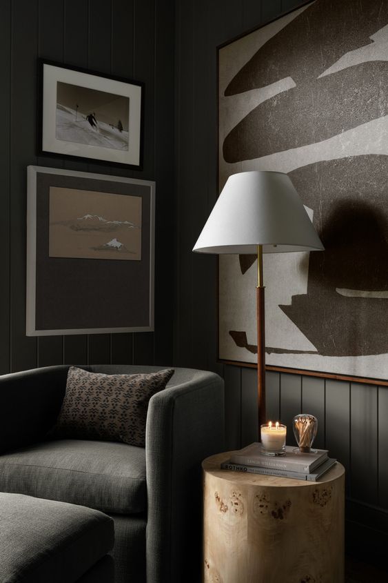
Dark Color Schemes
A designer may choose a dark color scheme in various situations, depending on the desired outcome and the specific characteristics of the space. Here are a few scenarios where a dark color scheme could be appropriate:
1. INTIMACY AND COZINESS
Dark colors, such as deep blues, rich browns, or charcoal grays, can create a sense of intimacy and coziness in a space. This can be ideal for bedrooms, libraries, or lounges, where a warm and inviting ambiance is desired. Dark colors can make a room feel more enclosed and cocoon-like, providing a sense of comfort and relaxation.
2. DRAMA AND SOPHISTICATION
Dark color schemes often evoke a sense of drama and sophistication. They can add a touch of elegance and luxury to a space, making it feel more formal and refined. For example, a dining room or a high-end boutique may benefit from a dark color palette, creating a sense of opulence and creating a striking visual impact.
3. ACCENTUATING ARCHITECTURAL FEATURES
In spaces with unique architectural details or focal points, a dark color scheme can help accentuate those elements. By using darker hues on walls or surfaces, designers can create a contrast that draws attention to intricate moldings, exposed brick, or other distinctive architectural features.
4. CREATING CONTRAST AND HIGHLIGHTING ARTWORK
Dark color schemes can serve as an excellent backdrop for showcasing artwork, sculptures, or other decorative elements. By using dark walls or finishes, designers can create a contrasting effect that allows artwork or objects to stand out and become the center of attention.
5. REDUCING GLARE OR DISTRACTIONS
In spaces where glare or distractions are a concern, such as home theaters or media rooms, a dark color scheme can be beneficial. Dark walls or surfaces absorb light rather than reflecting it, minimizing glare from screens and reducing visual distractions, thus enhancing the overall viewing experience.
6. CONTEMPORARY OR EDGY AESTHETICS
Dark color schemes are often associated with contemporary and edgy design styles. Spaces with a modern or minimalist approach, such as urban lofts or industrial-inspired interiors, can benefit from a dark color palette to create a sleek and sophisticated look.
It’s important to note that when using a dark color scheme, designers need to consider the balance of light and dark elements in the room. Adequate lighting, both natural and artificial, becomes crucial to prevent the space from feeling overly dim or oppressive. Additionally, incorporating lighter accents, such as furnishings, artwork, or textiles, can help create contrast and prevent the space from feeling too heavy or monotonous.
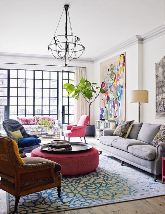
Bright Color Schemes
Designers may choose a bright or colorful color scheme in various situations where they aim to create a vibrant, energetic, or playful atmosphere. Here are some scenarios where a designer might opt for a bright or colorful color scheme:
1. SPACES FOR CHILDREN
Colorful and vibrant schemes are often chosen for spaces dedicated to children, such as nurseries, playrooms, or schools. Bright colors can stimulate creativity, imagination, and a sense of fun, creating an engaging environment for children.
2. COMMERCIAL AND RETAIL SPACES
In commercial or retail settings, a bright or colorful color scheme can help attract attention, create a memorable brand identity, and evoke a lively and dynamic atmosphere. Retail stores, cafes, restaurants, or entertainment venues often utilize bold and eye-catching colors to stand out and leave a lasting impression on customers.
3. POP ART OR RETRO-INSPIRED SPACES
Bright and bold color schemes are often associated with pop art or retro-inspired aesthetics. These styles embrace vibrant hues, strong contrasts, and playful combinations to create a visually striking and expressive look. Spaces with a modern or eclectic design approach might incorporate such color schemes to add a sense of personality and a nod to artistic movements.
4. FITNESS OR RECREATIONAL AREAS
Gyms, fitness studios, or recreational facilities often incorporate bright and energetic color schemes. These colors can promote an active and invigorating atmosphere, motivating individuals to exercise or engage in physical activities. Vibrant hues like oranges, yellows, or energetic blues can convey energy, positivity, and enthusiasm.
5. CREATIVE AND ARTISTIC ENVIRONMENTS
Designers may choose a bright or colorful color scheme for spaces dedicated to creative pursuits, such as art studios, craft rooms, or offices of designers, writers, or musicians. Such environments benefit from stimulating and inspiring colors that encourage imaginative thinking, free expression, and productivity.
6. URBAN OR CONTEMPORARY AESTHETICS
Bright and colorful color schemes are often embraced in urban or contemporary design styles, where boldness and visual impact are sought after. These schemes can be used to create a sense of vibrancy and reflect the energetic nature of urban life. This style choice is common in modern apartments, commercial spaces, or urban-themed establishments.
While a bright color scheme can add excitement and personality to a space, it is essential to ensure a cohesive and balanced composition. Designers consider color harmonies, contrast, and the overall spatial context to avoid overwhelming the space or creating visual chaos. Strategic use of neutrals or muted tones as a backdrop, along with well-placed accents or focal points, helps maintain a harmonious and visually pleasing balance within the overall scheme.
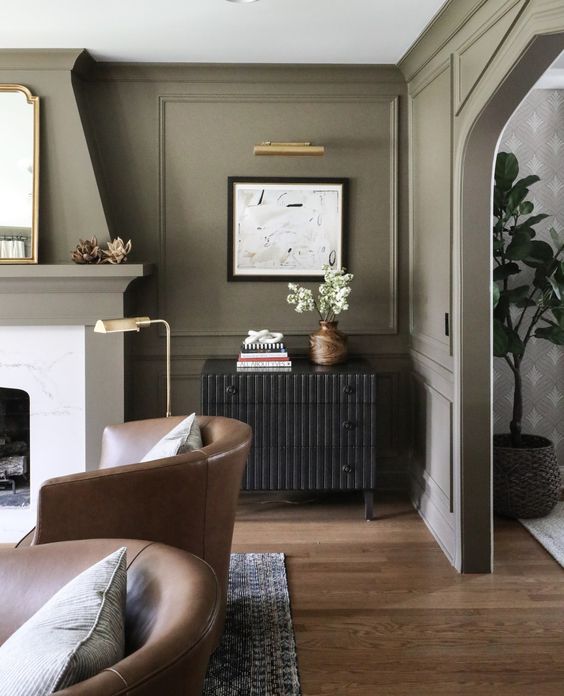
Muted Color Schemes
Designers may choose a muted or subdued color scheme in various situations where they want to create a calm, sophisticated, or understated atmosphere. Here are some scenarios where a designer might opt for a muted or subdued color scheme:
1. RELAXING AND SERENE ENVIRONMENTS
Muted or subdued color schemes are often used in spaces intended for relaxation and tranquility, such as bedrooms, spas, or meditation rooms. Soft pastels, gentle neutrals, or muted earth tones can create a serene and calming ambiance, promoting a sense of peace and well-being.
2. CLASSIC OR TIMELESS AESTHETICS
Muted color schemes are commonly associated with classic or timeless design styles. Neutral colors, such as soft grays, beige, or off-whites, provide a versatile and elegant backdrop that stands the test of time. These schemes are often chosen for spaces where longevity and enduring appeal are desired, such as formal living rooms, traditional dining areas, or sophisticated offices.
3. SOPHISTICATED AND REFINED INTERIORS
Muted or subdued color schemes can convey a sense of sophistication and refinement. By using muted tones like deep blues, olive greens, or warm browns, designers can create an atmosphere of understated elegance and maturity. This approach is often employed in upscale restaurants, luxury hotels, or executive boardrooms.
4. ACCENTUATING TEXTURES AND MATERIALS
Muted color schemes can highlight the textures and materials used in a space. By employing soft or muted colors, designers allow the inherent qualities of natural materials, such as wood, stone, or textiles, to take center stage. This adds depth and richness to the space while maintaining a sense of understated sophistication.
5. CREATING VISUAL HARMONY
In spaces where multiple elements or patterns coexist, a muted or subdued color scheme can provide visual harmony and prevent overwhelming the senses. These schemes are commonly used in spaces with intricate architectural details, busy patterns, or a mix of bold textures and shapes. By toning down the color palette, designers ensure that the focus remains on the form, texture, or pattern of the elements rather than competing colors.
6. SUPPORTING MINIMALIST OR SCANDINAVIAN DESIGN
Muted color schemes align well with minimalist or Scandinavian design styles, which prioritize simplicity, clean lines, and a sense of calm. Soft neutrals, pale pastels, or gentle grays contribute to a minimalist aesthetic by creating a visually clean and uncluttered environment. These schemes are often seen in modern apartments, Scandinavian-inspired interiors, or spaces that aim for a sense of serenity.
While a muted or subdued color scheme may convey a sense of calm and understatement, designers ensure that the space doesn’t become too monotonous or lacking visual interest. They incorporate subtle contrasts, texture variations, or carefully chosen accent colors to add depth and prevent the scheme from feeling flat or uninspiring.

I loved reading this. It was so helpful to think through how to use color when designing a space.
Thank you, Khalan! I’m always happy to help if you have any questions about color (or anything else) for your home!